
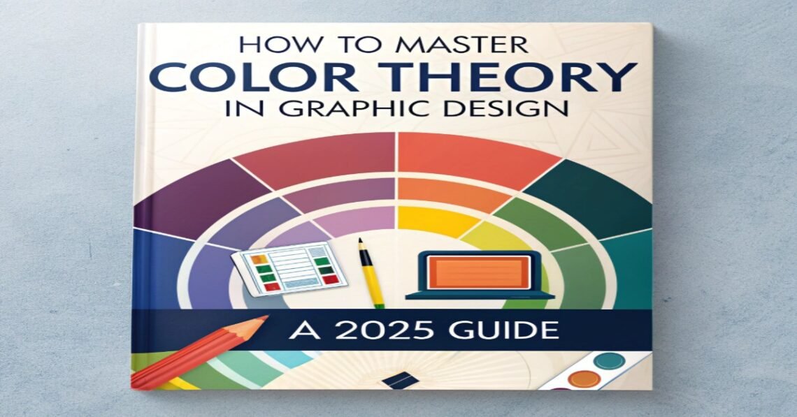
🌟 Introduction: The Power of Color in Design
Color is more than just aesthetics — it’s a strategic tool that communicates emotion, influences perception, and guides user action. In 2025, understanding color theory is essential for designers creating impactful branding, marketing materials, or digital content.
This guide explores advanced color theory techniques, psychology, and practical applications for modern graphic design.
SEO Keywords:
color theory in graphic design, 2025 color trends, color psychology for designers, best color palettes, digital design color tips, branding color strategies
1️⃣ Basics of Color Theory Every Designer Should Know
Understanding the color wheel is fundamental:
- Primary Colors: Red, Blue, Yellow
- Secondary Colors: Green, Orange, Purple
- Tertiary Colors: Combinations of primary and secondary colors
Color Harmonies:
- Complementary: Opposite colors for high contrast
- Analogous: Adjacent colors for harmony
- Triadic: Three evenly spaced colors for vibrant balance
- Monochromatic: Variations of a single hue for subtlety
Tip: Use color harmonies to create visual appeal and balance in design.
2️⃣ Color Psychology: Evoking Emotion Through Design
Colors influence mood, perception, and behavior:
- Red: Energy, urgency, passion
- Blue: Trust, calm, professionalism
- Green: Growth, sustainability, balance
- Yellow: Optimism, creativity, attention-grabbing
- Purple: Luxury, creativity, ambition
- Orange: Enthusiasm, friendliness, confidence
Application: Match color choices with brand personality and target audience to maximize impact.
3️⃣ 2025 Color Trends for Graphic Design
Staying updated with color trends is crucial:
- Vibrant gradients for digital interfaces
- Soft pastels for minimalistic branding
- Earth tones for sustainability-focused designs
- Neon & cyberpunk-inspired palettes for futuristic content
- Muted, sophisticated palettes for professional brands
SEO Keywords:
graphic design color trends 2025, trending color palettes, modern color schemes
4️⃣ How to Choose Effective Color Palettes
Steps for Choosing the Right Palette:
- Understand brand values and audience
- Start with 1–2 primary colors
- Add accent colors for emphasis
- Test contrast and readability
- Ensure consistency across all platforms
Tools for Color Selection:
- Adobe Color
- Coolors.co
- Canva Color Palette Generator
5️⃣ Accessibility and Inclusive Color Design
Inclusive design ensures all users can interpret your content clearly:
- Maintain high contrast ratios for readability
- Avoid relying solely on color for information
- Test palettes for color blindness using tools like Color Oracle
- Consider cultural interpretations of color
Tip: Accessibility improves user experience and brand reputation.
6️⃣ Applying Color Theory Across Mediums
- Branding: Logo, typography, social media graphics
- Web Design: Buttons, CTAs, backgrounds, hover states
- Print Design: Flyers, brochures, packaging
- Motion Graphics: Animations, transitions, video overlays
Consistency in color application strengthens brand recognition and aesthetic appeal.
7️⃣ Tools and Resources for Color Mastery
- Adobe Illustrator & Photoshop: Advanced color controls
- Canva: Pre-made palettes and AI-assisted selection
- Coolors.co: Generate harmonious color schemes
- Adobe Color Wheel: Explore color harmonies and trends
- Paletton: Interactive palette experimentation
🌟 Conclusion
Mastering color theory in 2025 is essential for graphic designers looking to create impactful, memorable, and emotionally resonant designs. By combining knowledge of color harmonies, psychology, trends, and accessibility, designers can elevate any project from good to outstanding.